Branding Projects
Event Branding
Center for Ethics, Diversity and Workplace Culture (CEDWC)
Center for International Business Education and Research (CIBER)
Translational Research Center (TRC).
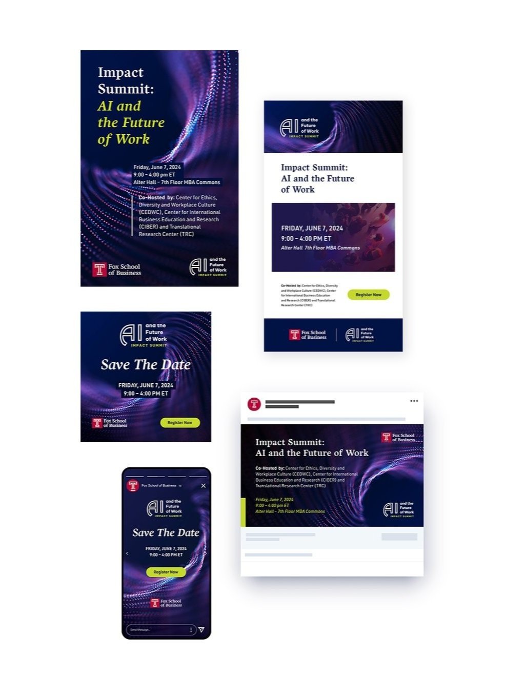
I branded an event co-hosted by three centers: CEDWC, CIBER, and TRC, focusing on AI’s impact on equity, workplace culture, and workforce preparation. The client requested a futuristic theme for all collateral, including save-the-dates, social graphics, posters, and emails.
I also created a unified event lockup, ensuring all materials were instantly recognizable as part of the same initiative. Rather than literal robotics imagery, I opted for a sleek, ultra-modern aesthetic that conveys innovation while remaining professional and aspirational.
Advertising Campaign
2025-2026 Brand Campaign, Temple University Marketing
I developed this campaign concept from the iconic Temple T—both visually and in spirit—capturing what it means to be Temple Made today. I built it on the original 2012 Temple Made campaign, evolving it into the perfect next chapter. While the "Temple Made" framework has long defined our voice, I reframed it with MADE FOR and MADE TO language, opening limitless ways to speak to audiences, ambitions, and colleges across the university.
Visually, I designed the T frame to add flexibility and depth. Its openness reflects the T’s meaningful legacy and provides a structure adaptable to photography, motion, and line work, while maintaining a cohesive and recognizable brand system.
Logo Development
Client: Amica Talent
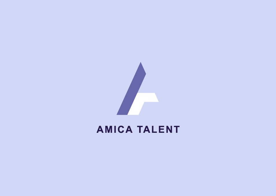
Amica Talent, a renewable energy recruitment company founded by a close friend, approached me to design a high-end logo. Drawing on key industry characteristics—precision, technical expertise, and innovation—I created a clean, angular mark using the initials A and T.
This design language extends across the brand, with the same sharp, geometric shapes carried through marketing materials to reinforce the brand’s professional and modern identity.


Client: Cloudline Logistics
Early in my career, I worked on Cloudline Logistics’ rebrand, developing multiple logo concepts that conveyed directional progress and transportation. The client selected one of my personal favorites, which became the foundation for business cards and the website, built in collaboration with the Creative Director. This project allowed me to explore conceptual sketching, logo development, and full brand implementation in a fast-paced, real-world context.
https://www.cloudlinelogistics.com
Wellness Branding & Identity
I partnered with MyVitamin to enhance their holistic health branding and create clear, functional design systems for patients navigating chronic illness. While retaining the existing logo, I developed a secondary color palette—Periwinkle, Tangerine, Pistachio, Powder, and Salmon—designed for legibility and hierarchy across marketing materials.
These colors were applied consistently across PowerPoint decks, recipe books, macro handouts, and a comprehensive patient e-book, helping organize information, define sections, and create an approachable, cohesive visual identity.


